What a resume should look like on the page
What a reader sees first, the section order, the length, and which parts carry signal rather than decoration.
8 minute readPublished Updated
Short answer
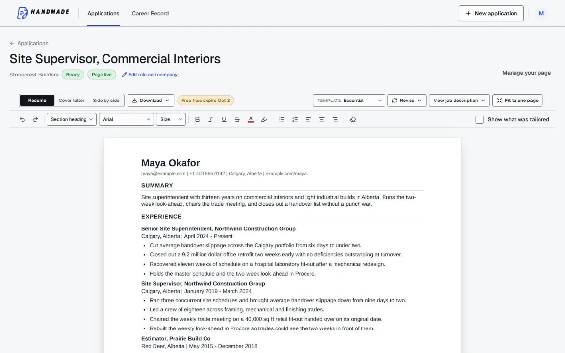
One column, marked section headings, one ordinary font, and newest first the whole way down. The top third of page one holds your contact line, two or three lines that could only be about you, and your current role with its best evidence underneath; nothing else earns that space. Sidebars, rating bars and skill clouds cost you with the reader and with the parser at the same time.
Do this next
- Set margins between half an inch and an inch, and body type at ten to twelve point.
- Collapse any sidebar or second column back into one reading order.
- Put your current role directly under the summary, and education below it.
- Swap every rating bar and skill cloud for one sentence of real evidence.
- Rename the file with your own name and the role before you attach it.
What a reader sees first
The top third of page one carries the decision. A reader arrives knowing nothing about you, and a first read is quick: it forms a view of what you are, what level you work at, and whether to keep going before the page has been read in full. Everything lower down is read by somebody who has already chosen to spend more time on you.
So the top third gets your name and contact line, two or three lines that could only be about you, and the first role with your strongest evidence under it. Nothing else earns that space: not an objective, not a skills grid, not a coloured banner, and in North America, the UK and Ireland, by convention, not a photograph either. Where a photograph is customary, as it commonly is in Germany, the top of the page is where it conventionally goes.
A layout that holds up on a quick first read is easy to describe. Simple structure, clearly marked section headings, one plain font, bold job titles with bulleted accomplishments underneath. A layout that makes a quick read hard is cluttered: long unbroken sentences, multiple columns, and almost no white space to rest in.
Write for the fast reader and the careful one
How carefully your resume gets read depends on the pipeline it lands in, and you rarely know which one that is before you send. A small specialist team reads properly and will ask you about a specific line. A high-volume corporate funnel gives page one a fast pass and decides. Both are ordinary, and one document has to work in both.
That is not a compromise, because the two readers want the same thing in a different quantity. A clear top third satisfies the skim. Real detail underneath rewards anyone who keeps going. What fails both is the middle setting: a page of medium-length, medium-specific lines with nothing at the top and nothing to dig into.
One rough signal helps, and it is a heuristic rather than a rule. A long, structured submission process tends to sit in front of a high-volume pipeline, so a long form with dropdown questions usually means a fast pass and an emailed application to a named person usually means a careful one.
What order should resume sections go in?
Reverse chronological order is the default in practice across markets because it answers the question the reader is actually asking, which is what you do now. Any structure that reorders your history to obscure something reads as concealment and makes a careful reader look harder for what is missing.
Use a summary rather than an objective. An objective states what you want; the reader is screening for what they need, and every applicant wants the job, so the line carries no information while occupying the most valuable space on the page.
- Contact linename, one phone number, one professional email address, and one link worth clicking.
- Summarytwo or three lines that could only be about you, aimed at this posting.
- Experiencenewest first, with the most bullets under recent roles and fewer as roles age.
- Educationabove your experience while you are a student or new graduate, below it once you have work to show.
- Everything elseskills, certifications, and projects, in whichever of those orders your field rewards.
- Nothing at all after that. In these markets there is no section that improves a resume by existing, though some markets conventionally close with a block of their own: a place, date and signature on a German Lebenslauf, a declaration line on an Indian public-sector application.
How long should a resume be?
Length is proportional to your relevant evidence rather than to your seniority alone, so the answer is one page while it fits on one and two once it genuinely does not. What reviewers punish is padding at any length: a padded single page reads as thin, and a tight second page reads as depth.
That is as far as the appearance question goes. Our guide on one page or two owns the decision itself and works through the cases where the call is close, what belongs on which page, and how to cut honestly to a target. The part that never changes is that page one carries the decision, whatever the total.
Decoration versus signal
The design question has an unusually clean answer, because the human side and the machine side point the same way. Cluttered multi-column layouts are the hardest for a person to skim, and columned designs, graphics, and image uploads are common reasons a file fails to extract into text: a parser has to rebuild the reading order before it can read the words, and an image has no text layer at all. A two-column template with icons and a sidebar costs you twice, and the human cost is the one you cannot appeal.
Skill rating bars are the clearest case of decoration dressed as information. Four filled dots out of five is a claim with nothing behind it, and no reader can tell what your four means against anybody else's. That same strip of page spent on one sentence about something you built is signal.
A striking resume that worked for somebody else is weak evidence, because the design usually was not the thing doing the work. Our templates take the decision away on purpose: single column, fixed and restrained typography, deterministic reflow, and both the PDF and the DOCX checked for text extraction and page fit after rendering, so the file you send has been checked for the failures a layout choice would otherwise introduce.
The settings to use if you would rather not think about them
These are the defaults that stay out of the way. None of them wins you anything on its own; getting one badly wrong is visible immediately.
- Margins half an inch to one inch, consistent on all four sides.
- Body text ten to twelve point, in one ordinary font. Headings one or two points larger, or bold.
- One font for the whole document, and bold used only for job titles and section headings.
- Line spacing single, with a clear blank line between roles rather than between every bullet.
- Bullets as real list items, never a hyphen typed at the start of a paragraph.
- Left-aligned body text. Justified text opens uneven gaps that make a page harder to skim.
- File named with your name and the role, so it is findable in a folder of two hundred attachments.
What to cut
Most resumes improve by subtraction. The test worth applying is whether you could hold a conversation about a line: put nothing on the page you would not want to be asked about, and if you list a skill, be ready to talk about it.
A vague bullet is the easiest line on a page to skip. Something like 'saved a lot of time by automating an email process' gives an interviewer nothing to ask about, and a bullet nobody can ask about may as well not be on the page. Replace it or delete it.
- High school, once you hold a degree or any real work history. Indian early-career hiring is the common exception, where campus recruiters often publish eligibility criteria against Class 10 and Class 12 aggregates.
- The objective statement. It says what you want; the reader is screening for what they need.
- Full postal addresses, dates of birth, marital status, and photographs, which are conventionally left off in North America, the UK, and Ireland.
- Skill clouds and rating bars covering anything you could not discuss for five minutes.
- Bullets that describe a duty instead of what happened because you did it.
- The references line. In North America, the convention is to keep references on a separate sheet and offer them when they are asked for. British practice commonly still accepts a line saying they are available on request.
Common questions
How long should my resume be?
Where should education go?
What font and font size should a resume use?
Should my resume have a photograph?
Do columns and graphics really cause problems?
How many bullets should each job have?
Use this in Handmade Resume
Keep your full work history in one Career Record, then tailor the top of your resume for the role you want. You can edit every line before downloading a format-checked PDF or DOCX.
2 complete application sets free, at the same quality as a paid plan. No card required.